
findings
Lo-Fid:

Mid-Fid:

Final concept:

actionable takeaways
Continue refining task flows to minimize user effort and improve overall efficiency.
Implement more frequent, iterative user tests to catch potential usability challenges early.


competitor analysis
methodology
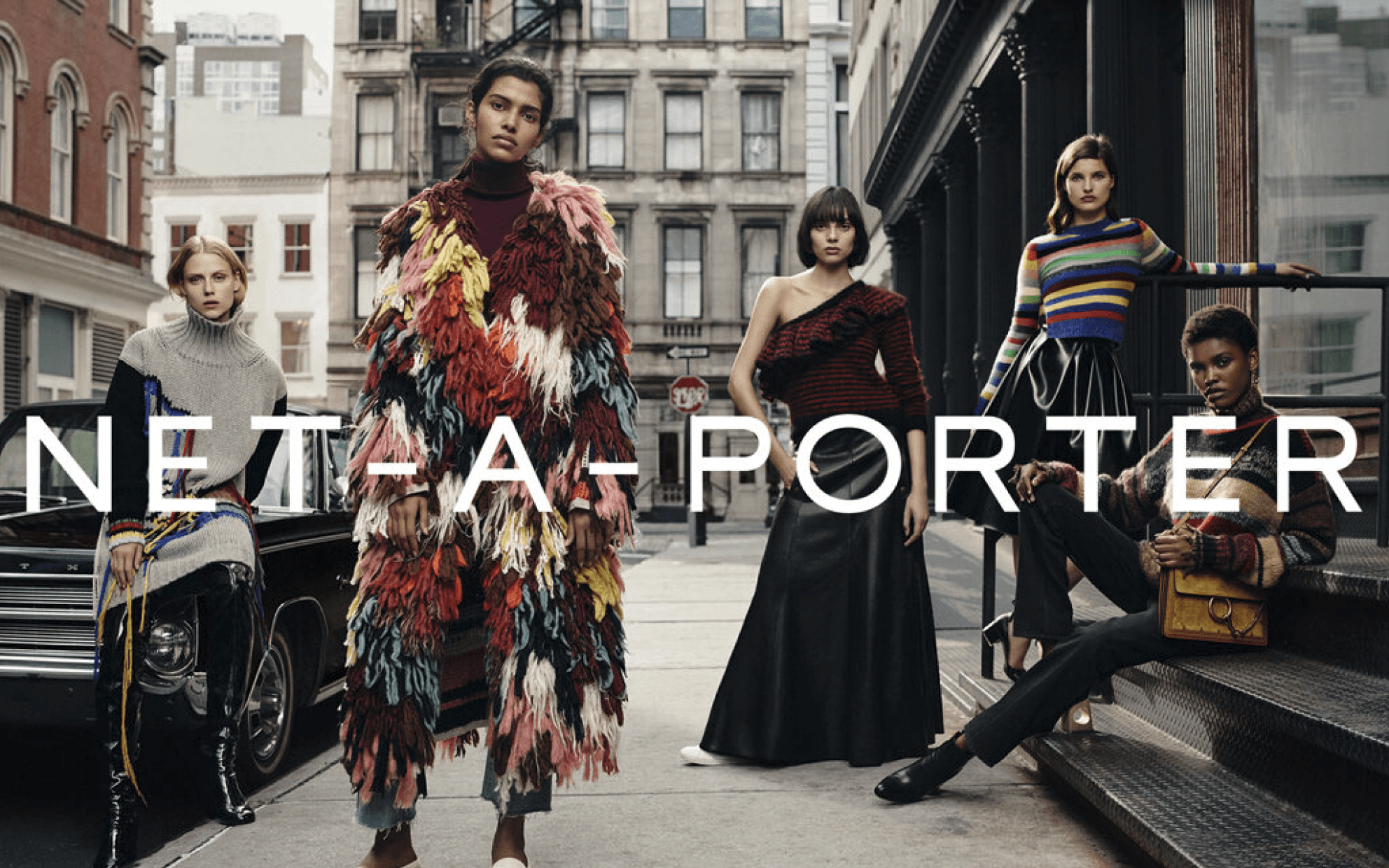
A comprehensive audit of four leading clothing web apps: Net-a-Porter, Farfetch, MatchesFashion, and Ssense, was conducted to identify the most effective features and design elements employed by each platform. The objective of this analysis was to highlight best practices and uncover potential areas for improvement in Beau Monde's strategy.
design process & tools
My role
research & design
Conducted user interviews and competitor analysis to identify
the needs and preferences of professional millennial women.
Identified key features and design elements that resonated
with the target audience.
tools
webaim contrast Tool:
Accessibility standards.
notability:
User Flows, Lo-Fid Wireframes.
figma:
Mid & Hi-Fidelity wireframes,
interactive prototypes.


findings
user research
objective
Evaluate the efficacy/efficiency of the app’s UI and features.
Identify usability issues & gather insights to improve the overall user experience.
interactive prototype
usability testing
Method:
Participants complete tasks simulating real-life app use and provide qualitative feedback on UI, navigation, and overall satisfaction.
Search Features:
Find a specific product using the search bar.
Filtering Functions:
Apply filters to narrow down product options by category, size, and colors.
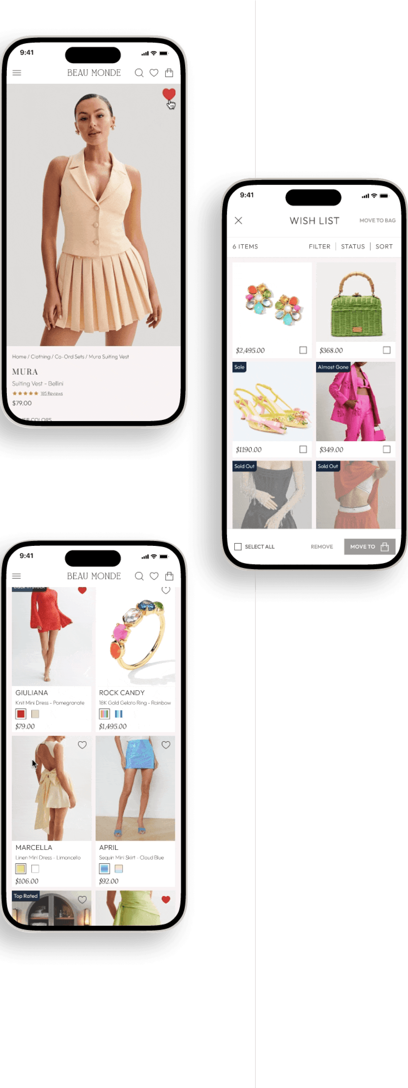
Wishlist:
Add items to their wishlist and view the wishlist.
Shopping Bag:
Move items from the wishlist to their shopping bag.
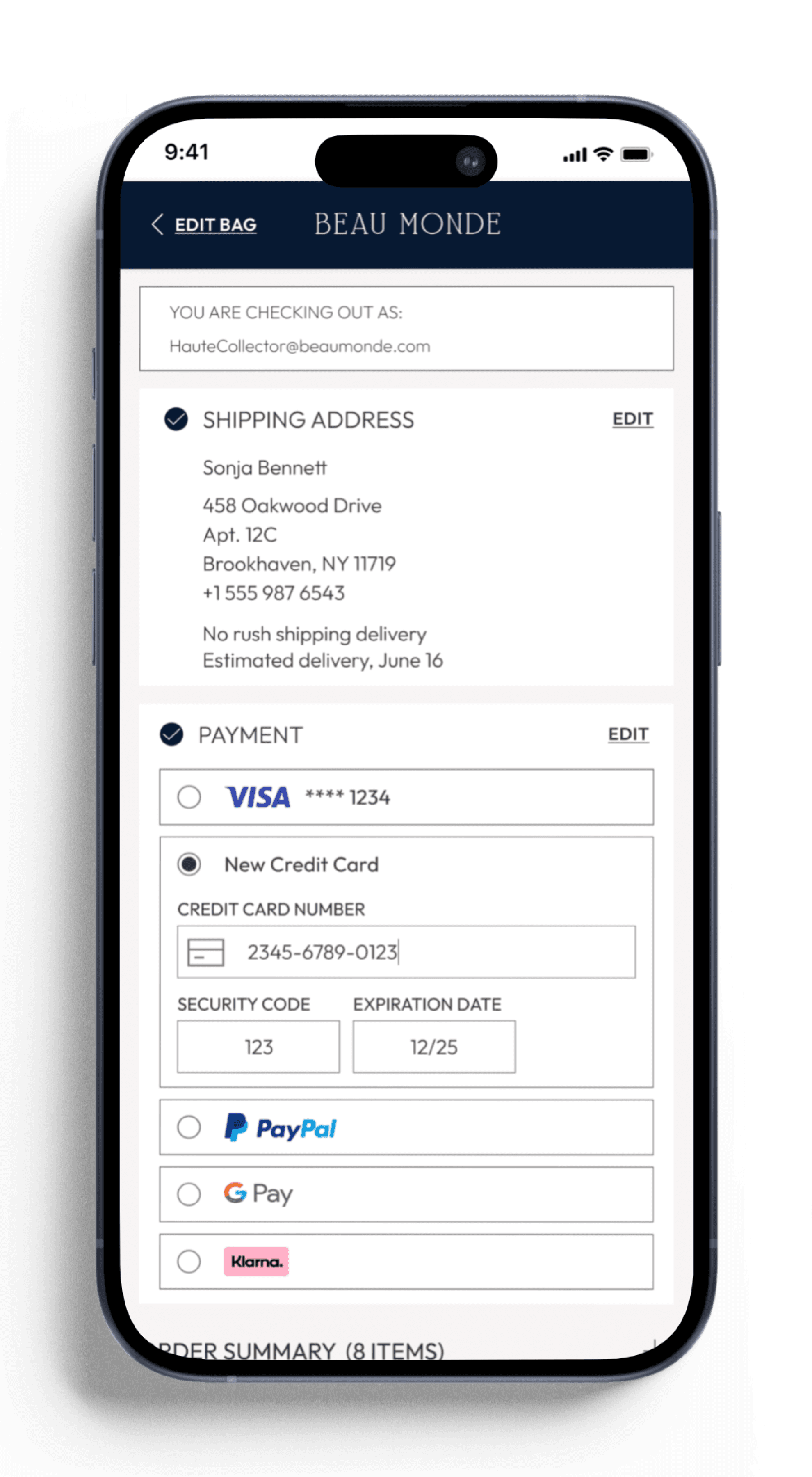
Checkout:
Complete the checkout process, review order before submitting payment.
General Navigation:
Navigate through the app, exploring different categories and pages.
Insights
Search Features:
Most participants found the search bar easy to use and could quickly locate specific products.
Filtering Functions:
Easy to locate and use, allowed users to narrow down search results effectively.
Wishlist:
Straightforward, users liked the option to save products for later.
Shopping Bag:
Checkbox activation feature was unintuitive and frustrating, disrupting their shopping flow.
Desire for straightforward method to select/deselect items in wishlist/shopping bag. They suggested automatic tap-to-select functionality for efficiency.
Checkout:
Smooth, with well-defined steps for entering shipping and payment information.
General Navigation:
Layout praised for clean and pleasing aesthetic.
Participants found it easy to browse different product categories and subcategories.
Name:
Sonja Bennett
age:
32
location:
New York City, NY
occupation:
Marketing Professional
user persona

early ideation
Digitally sketched low-fidelity and digitally built mid-fidelity wireframes were pivotal in bringing the final design to life.
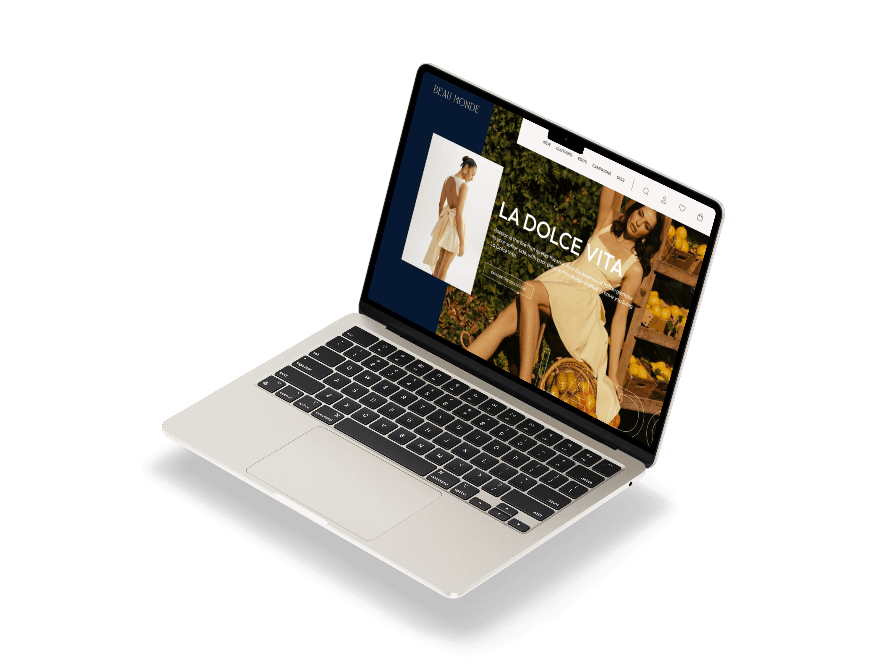
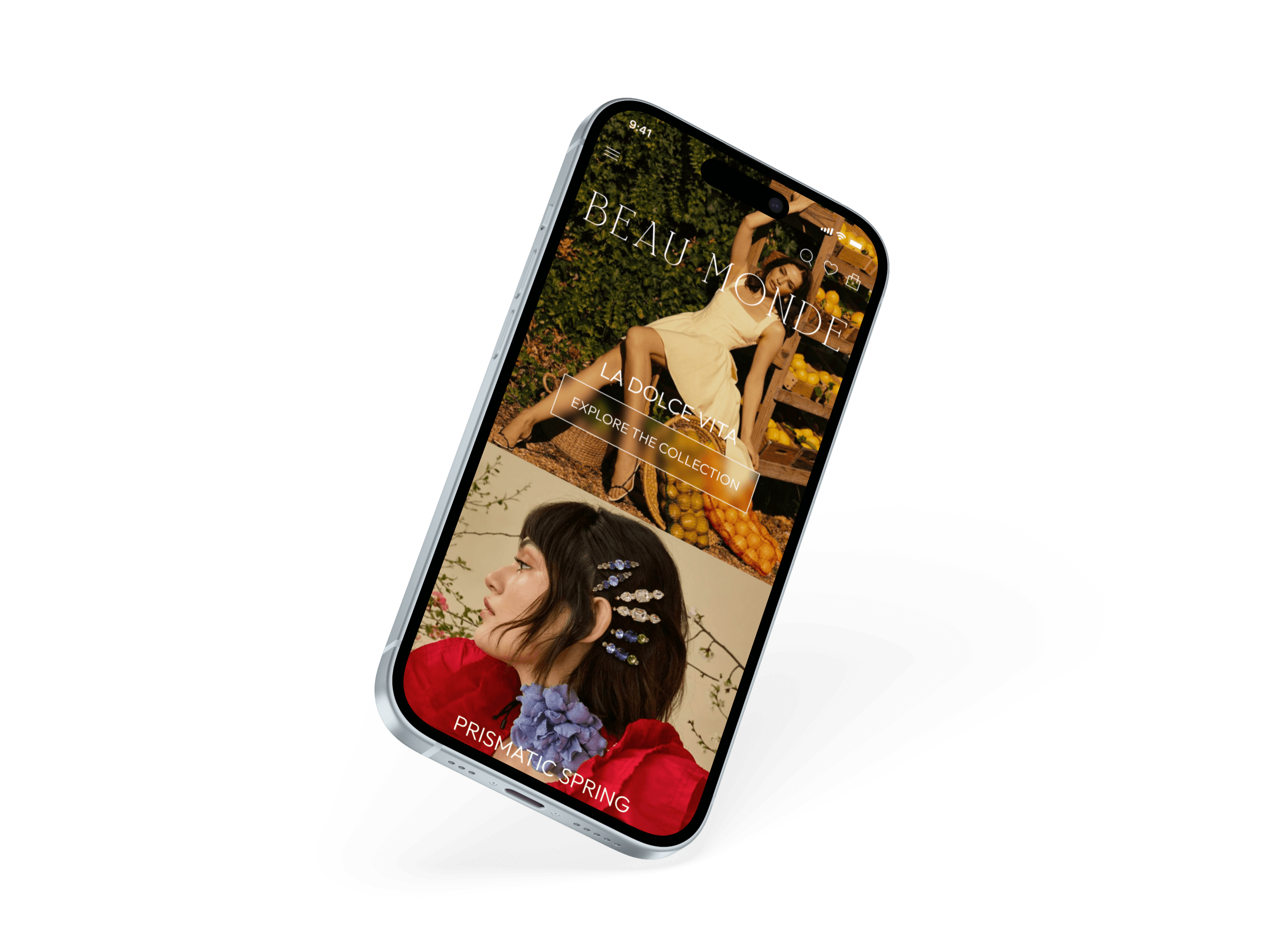
responsive screens
logos
The Beau Monde logo conveys sophistication and clarity, as the clean, bold
typography of Qefila complements the refined aesthetics of the platform.
UI Style Guide
primary logo:


submark:
favicon:


palette
The primary color palette ensures visual clarity, allowing Beau Monde products
to stand out effectively.
Typography
Outfit font enhances the brand's visual clarity, aligns with a sophisticated and modern aesthetic, and ensures a consistent and accessible user experience. Suranna adds a classic touch.
Body:
Heading:
Heading 1
Font: Suranna / Font Size: 48px / Style: Regular
Heading 2
Font: Suranna / Font Size: 32px / Style: Regular
Heading 3
Font: Outfit / Font Size: 32px / Style: Bold
Heading 4
Font: Outfit / Font Size: 22px / Style: Light
Heading 5
Font: Suranna / Font Size: 20px / Style: Regular
Body 1
Font: Outfit / Font Size: 16 / Style: Medium
Lorem ipsum dolor sit amet, consectetur adipiscing elit, sed do eiusmod tempor incididunt ut labore et dolore magna aliqua.
Body 2
Font: Outfit / Font Size: 14 / Style: Light
Lorem ipsum dolor sit amet, consectetur adipiscing elit, sed do eiusmod tempor incididunt ut labore et dolore magna aliqua. Ut enim ad minim veniam.
Aa
Outfit
Light
Regular
Medium
Bold
Regular
Suranna
Aa
Font families:
Primary buttons:
Active State:
place order
SHOW ITEMS
MOVE TO
inActive State:
place order
SHOW ITEMS
MOVE TO
secondary buttons:
Active State:
REMOVE
inActive State:
REMOVE
rating:
Iconography:
key components
Continuing the minimalist approach ensures a clean, professional, and accessible interface that resonates with the brand’s modern and sophisticated image.
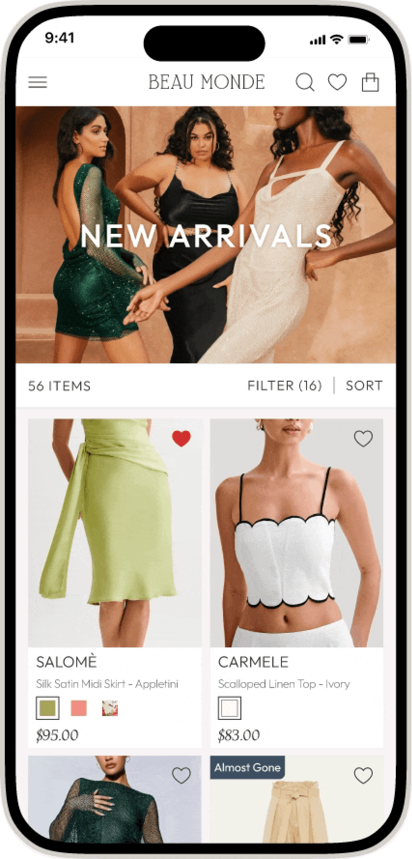
mockups

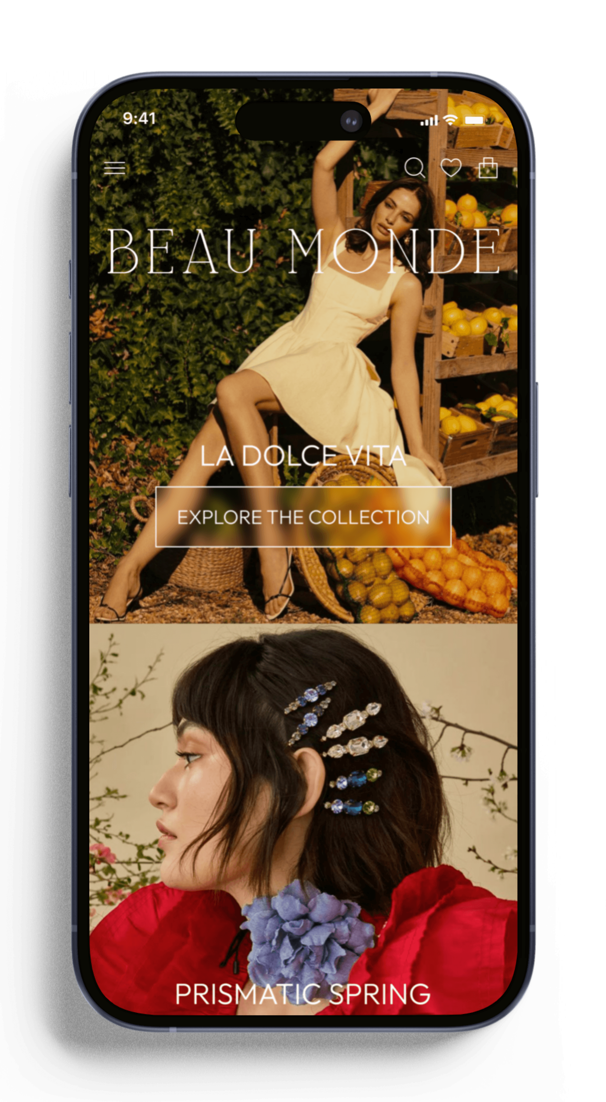
Splash screen
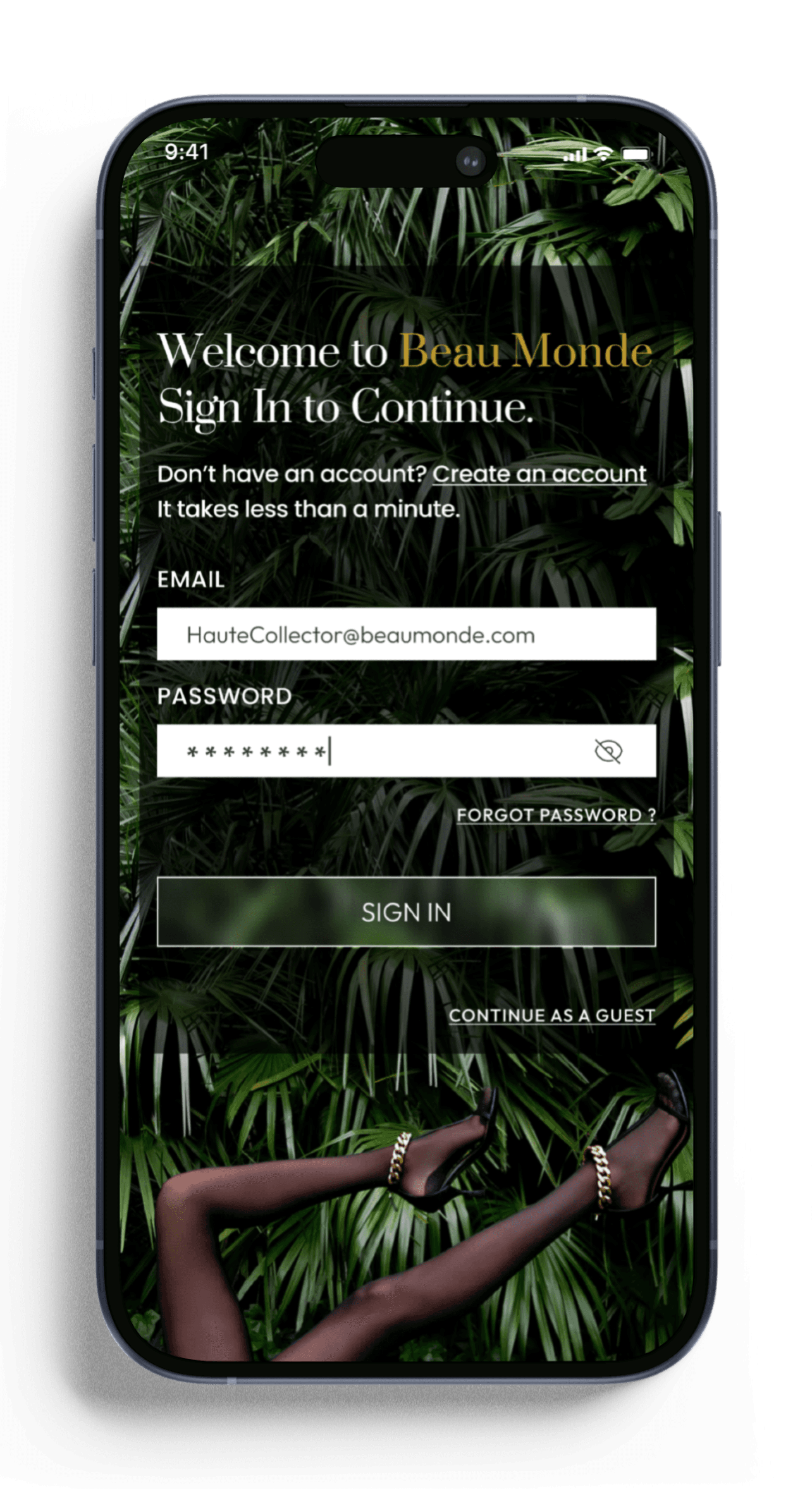
Login Screen
Home screen

user profile screen

Hamburger Menu
Search Screen

auto suggest search
product screen

New arrivals filtered screen
Filter size Screen
Filter Color screen

chosen filters Screen

wish list selected

Wish list updated
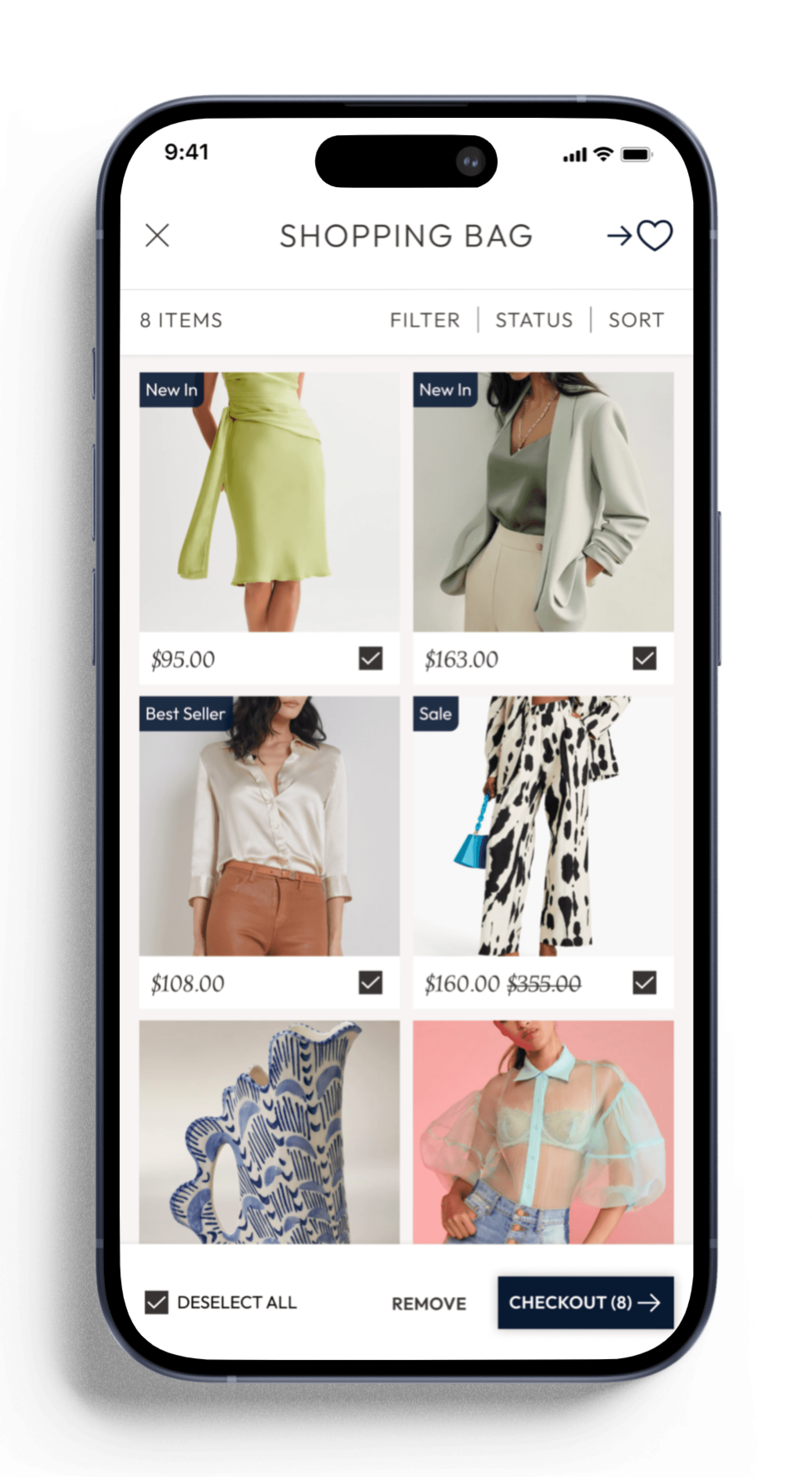
shopping bag
checkout screen

checkout in progress

checkout confirmed
retrospective
overview
The Beau Monde app aimed to create a seamless, captivating platform where users could easily discover unique fashion pieces and effortlessly curate their own personalized collections. The primary objective was to merge high-end aesthetics with a user-friendly and practical interface, ensuring that users could intuitively navigate the app, while still feeling immersed in a luxurious shopping experience.
what went well
visual design:
The attention to detail in typography, color palettes, and imagery successfully established a minimal and modern aesthetic, creating a high-end feel that aligns with the brand's vision of a refined experience.
user feedback:
User testing validated many design decisions, particularly the clear layout and navigation. Users appreciated the straightforward features such as auto-suggestions in search fields, extensive filters, and an easy checkout process.
accessibility:
Accessibility was prioritized from the start to ensure high contrast for readability & keyboard navigability.
prototyping:
Figma’s tools facilitated smooth prototyping and quick iterations based on feedback.
streamlining:
One challenge was simplifying the user journey by reducing unnecessary steps during key actions, like navigating between wishlist and shopping cart. Initial versions required too many steps to complete tasks, disrupting the flow. After user testing, I streamlined processes to improve efficiency and reduce friction.
challenges
key insights & improvements
balance:
While the app needed to be visually striking, it was essential to reduce cognitive load by minimizing the steps users had to take to complete actions. Streamlining user flows will be a key focus in future projects.


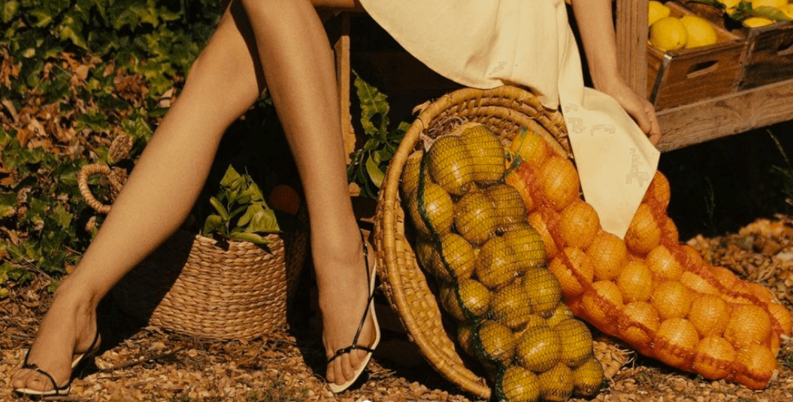
project overview
What in the world is beau monde?
Definition: "Beau Monde" is a French term that translates to "beautiful world" or
"fashionable society." It evokes a sense of luxury, sophistication, and elegance.
project description
Type:
Responsive e-commerce web-app.
Target Audience:
Professional millennial women.
Primary Goal:
Provide quality pieces in an easy-to-use interface.
Help women feel empowered and beautiful.
mission:
Web App Case Study
E-Commerce Responsive

(n.) The world of fashionable society.
beau monde
[ boh-mond ]
French
BEAU MONDE
BEAU MONDE

background:
Sonja’s job requires her to maintain
a polished appearance, but she has
limited time for shopping. With a keen
eye for quality and detail, she seeks an efficient e-commerce app that aligns with her hectic lifestyle with her refined taste in fashion. In her free time, Sonja enjoys spending time with friends, and traveling.
goals:
Track rewards points.
Access comprehensive item details
Discover the latest fashion trends and get style inspiration.
Quickly shop for & buy stylish, quality clothing.
motivations:
Wants to look professional for her career.
Enjoys being a trendsetter among her peers.
Appreciates an efficient shopping experience.
Looks for quality, comfort, and durability.
Passionate about fashion and enjoys experimenting with her style.
frustrations:
Limited filter options.
Navigating cluttered websites.
Inaccurate size recommendations.
Products that don't match description.
Complicated checkout process.
Slow load times.

user flow
The user flow highlights a critical pathway, starting from the user's arrival and ending with the completion of the filtering process. This streamlined journey ensures users can effortlessly navigate through product selections, economizing shopping time.


tertiary buttons:
Active State:
remove from wish list
move to bag
CLEAR ALL
inActive State:
Add to wish list
move to bag
CLEAR ALL
Blur button:
EXPLORE THE COLLECTION
Points Tracker:
beau monde elite club
bronze
silver
gold
platinum
$0 - $249
$250 - $499
$500 - $999
$1000+
Spend $350 more to reach Gold
see rewards
Product:
XS
S
M
L
XL
Product Image
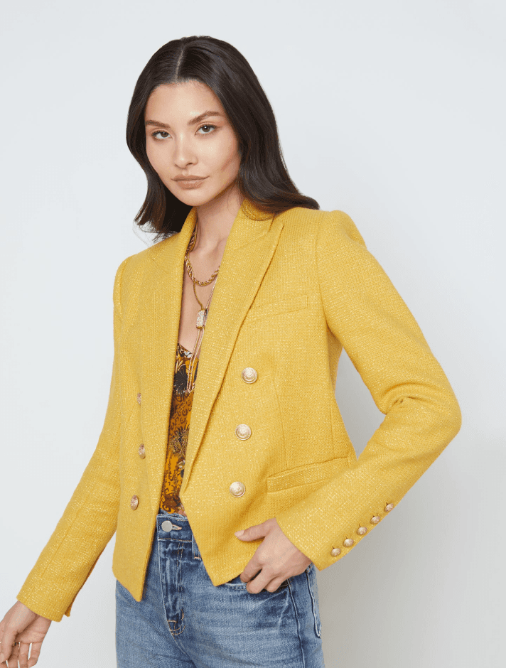
Best Seller
lila
Lurex Cotton Blazer - Saffron
$116.00
frustrating checkout process:
Mandatory account creation leads to cart abandonment.
Limited payment options and secure payment methods.
Poor Filter/Search Options:
Inadequate filters, such as missing color or material filters.
Search results irrelevant and broad.
No auto-suggestion.
lack of information:
Low quality images & insufficient product details.
Fake and/or hidden reviews.
confusing navigation:
Cluttered interface.
Complicated dropdown menus.
Too few or too many categories.
Poor mobile experience/not responsive.
common problems with Clothing Apps
problems & app solutions
Streamlined checkout process:
Guest checkout process.
Saved shipping and payment options.
Prominent CTA’s & action oriented language.
Robust Filter/Search Options:
Real-time suggestions & common search terms when users type in search field.
Advanced search algorithms with results based on user input, and purchase/browsing history.
Filters for category, size, color, price, material, etc.
ample information:
Multiple high-resolution images with zoom functionality.
Detailed product descriptions, sizes available, material information, and care instructions.
Ratings & reviews displayed prominently.
Intuitive Navigation:
Clear and consistent menu structures.
Sticky navigation panel at top of screen.
Organized categories.
Solutions The Beau Monde App Offers
checkboxes:
text fields:
HauteCollector@beaumonde.com
* * * * * * * *
Search our store
Mura Vest


BEAU MONDE
BEAU MONDE
(n.) The world of fashionable society.
[ boh-mond ]
French
beau monde
E-Commerce Responsive Web App Case Study
BEAU MONDE
BEAU MONDE
findings
competitor analysis
methodology
A comprehensive audit of four leading clothing web apps: Net-a-Porter, Farfetch, MatchesFashion, and Ssense to identify the most effective features and design elements employed by each platform. The objective of this analysis was to highlight best practices and uncover potential areas for improvement in Beau Monde's strategy.
design process & tools
My role
research & design
Conducted user interviews and competitor analysis to identify the needs and preferences of professional millennial women.
Identified key features and design elements that resonated with the target audience.
tools
webaim:
Contrast checker for
accessibility standards.
notability:
User flows & low
fid wireframes.
figma:
Mid & hi-fid
wireframes, prototypes.
problems & app solutions
common problems
frustrating checkout:
Mandatory account creation
leads to cart abandonment.
Limited payment options/secure
payment methods.
Poor Filter/Search:
Inadequate filters i.e.
missing material filters
Results irrelevant.
No auto-suggestion.
lack of information:
Low quality images &
insufficient info.
Fake/hidden reviews.
confusing nav:
Cluttered UI.
Not responsive.
Solutions
Fast checkout:
Guest checkout
Saved shipping &
payment options.
Prominent CTA’s.
Robust Filter/Search:
Real-time suggestions.
Advanced search
algorithms, results
based on user activity.
Filters for category,
size, color, price, etc.
ample information:
Multiple high-resolution images,
zoom functionality included.
Detailed product descriptions, sizes available,
material information, and care instructions.
Ratings & reviews displayed prominently.
Intuitive NAV:
Clear and consistent menu structures.
Sticky navigation panel at top of screen.
Organized categories.
project overview
What in the world is beau monde?
Definition: "Beau Monde" is a French term that translates to "beautiful world" or "fashionable society." It evokes a sense of luxury, sophistication, and elegance.
project description
TYPE:
Responsive e-commerce web-app.
Target Audience:
Professional millennial women.
Primary Goal:
Provide quality pieces in an
easy-to-use interface.
mission:
Help women feel empowered
and beautiful.
user research
objective
Evaluate the efficacy and efficiency of the app’s UI and features.
Identify usability issues & gather insights to improve the overall user experience.
interactive prototype
usability testing
Method:
Participants complete tasks simulating real-life app use and provide qualitative feedback on UI, navigation, & overall satisfaction.
Search Features:
Find a product using the search bar.
Filtering Functions:
Apply filters to narrow down product options by category, size, and colors.
Wishlist:
Add items to their wishlist/view wishlist.
Shopping Bag:
Move items from the wishlist to their shopping bag.
Checkout:
Complete checkout process, review order before submitting payment.
General Nav:
Navigate through the app, exploring different categories and pages.
Insights
Search Features:
Most participants found the search bar easy to use and could quickly locate specific products.
Filtering Functions:
Easy to locate and use, allowed users to narrow down search results effectively.
Wishlist:
Straightforward, users liked the option to save products for later.
Shopping Bag:
Checkbox activation feature was unintuitive and frustrating for users, disrupting their shopping flow. Users desired a straightforward method to select/deselect items in their wishlist/shopping bag. They suggested automatic tap-to-select functionality for greater efficiency and ease.
Checkout:
Smooth, with well-defined steps for entering shipping and payment information.
General NAV:
Layout praised for clean and pleasing aesthetic. Participants found it easy to browse different product categories and subcategories.
user persona
Name:
Sonja Bennett
age:
32
location:
New York City, NY
occupation:
Marketing Professional
background:
Sonja’s demanding job requires
her to maintain a polished
appearance, but she has
limited time for shopping.
With a keen eye for quality
and detail, she seeks an
efficient e-commerce app
that aligns with her hectic
lifestyle with her refined
taste in fashion. In her free
time, Sonja enjoys spending
time with friends, and traveling.
goals:
Track rewards points.
Access comprehensive item details
Discover latest fashion trends and get style inspo.
Quickly shop stylish, quality clothing.
motivations:
Wants a professional look for work.
Enjoys being a trendsetter.
An efficient/enjoyable shopping experience.
Looks for quality, comfort, & durability.
Passionate about fashion & enjoys experimenting with new styles.
frustrations:
Limited filter options.
Navigating cluttered websites.
Inaccurate size recommendations.
Products that don't match description.
Complicated checkout process.
Slow load times.
user flow
Streamlined journey from arrival thru completion of filtering process.
user flow
Streamlined journey from arrival thru completion of filtering process.
early ideation
Digitally sketched low-fidelity and digitally crafted mid-fidelity wireframes were pivotal in bringing the final design to life.
Mid-Fid:
Lo-Fid:
Final concept:
responsive screens
UI Style Guide
logos
The Beau Monde logo conveys sophistication and clarity, as the clean, bold typography of Qefila complements the refined aesthetics of the platform.
primary logo:
submark:
favicon:
palette
The primary color palette ensures visual clarity, allowing Beau Monde products to stand out effectively.
Typography
Outfit font enhances the brand's visual clarity, aligns with a sophisticated and modern aesthetic, and ensures a consistent and accessible user experience. Suranna adds a classic touch.
Heading:
Heading 1
Font: Suranna / Font Size: 48px / Style: Regular
Heading 2
Font: Suranna / Font Size: 32px / Style: Regular
Body:
Body 1
Font: Outfit / Font Size: 16 / Style: Medium
Lorem ipsum dolor sit amet, consectetur adipiscing elit.
key components
Continuing the minimalist approach ensures a clean,
professional, and accessible interface that resonates
with the brand’s modern and sophisticated image.
Primary buttons:
Active State:
SHOW ITEMS
inActive State:
SHOW ITEMS
tertiary buttons:
Active State:
remove from wish list
move to bag
inActive State:
Add to wish list
move to bag
Iconography:
rating:
Product:
XS
S
M
L
XL
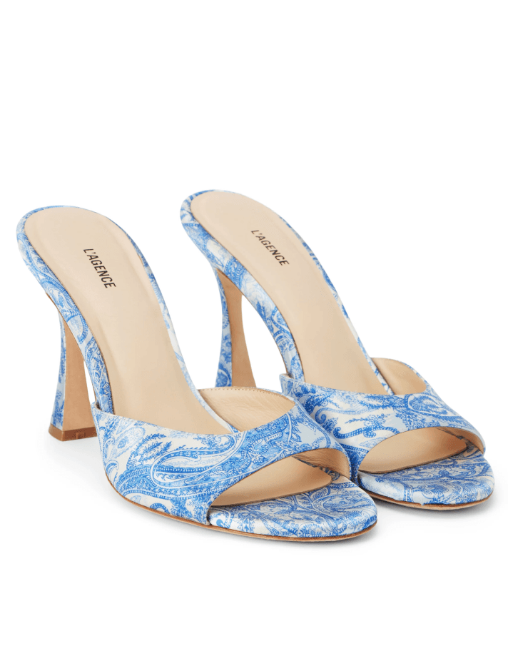
avery
Satin Peep-Toe Mule - Paisley

$325.00
Product Image
Best Seller
lila
Lurex Cotton Blazer - Saffron
$116.00
text fields:
HauteCollector@beaumonde.com
* * * * * * * *
EXPLORE THE COLLECTION
Blur button:
Points Tracker:
beau monde elite club
bronze
silver
gold
platinum
$0 - $249
$250 - $499
$500 - $999
$1000+
Spend $350 more to reach Gold
see rewards
mockups
Splash screen
Splash screen
Login Screen
Login Screen
Home screen
Home screen
user profile screen
user profile screen
Hamburger Menu
Hamburger Menu
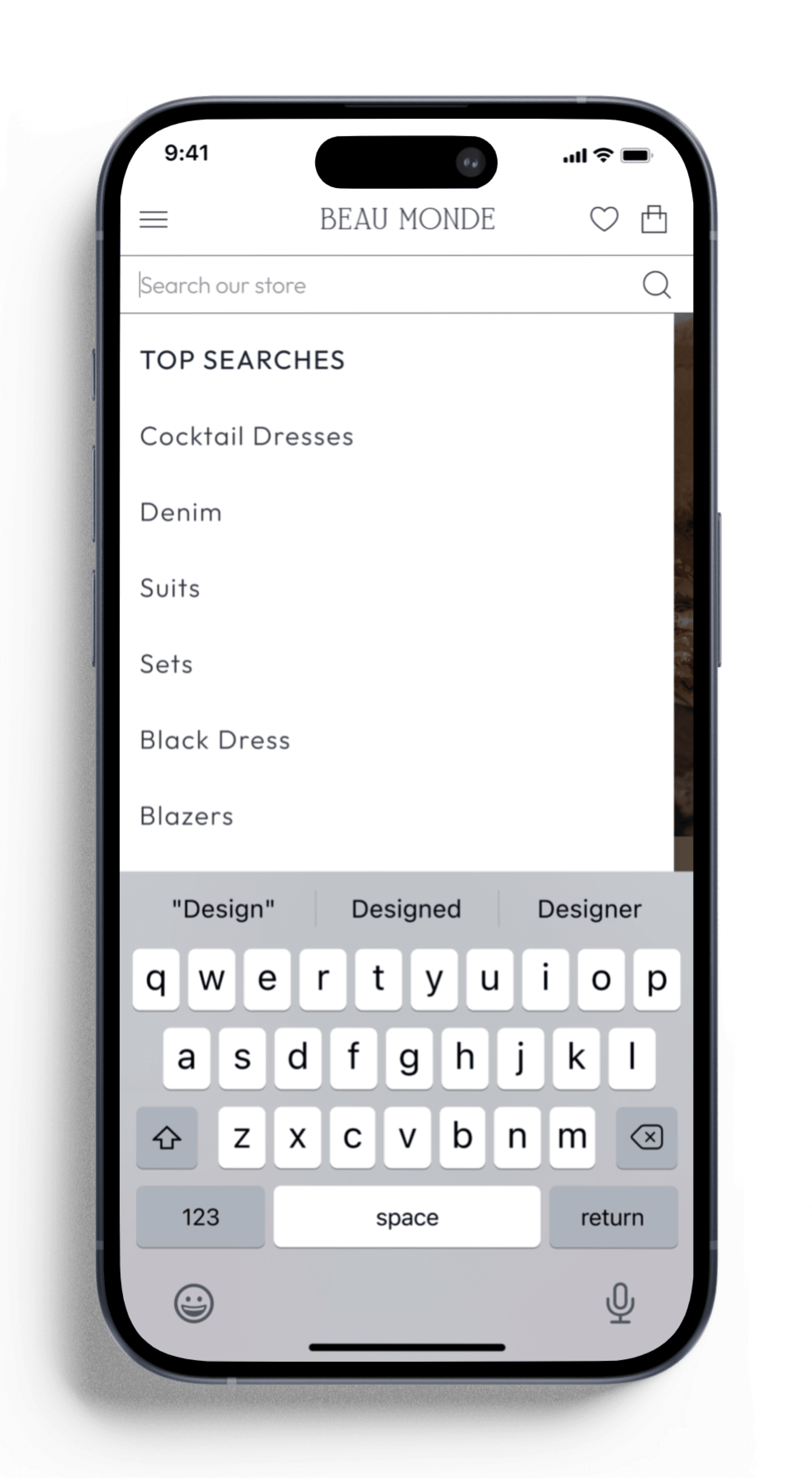
Search Screen
Search Screen
auto suggest search
auto suggest search
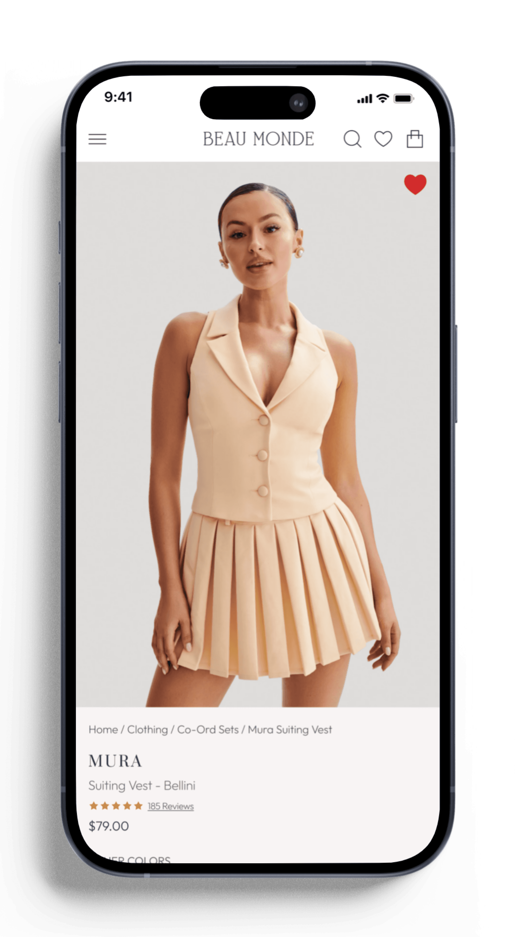
product screen
product screen
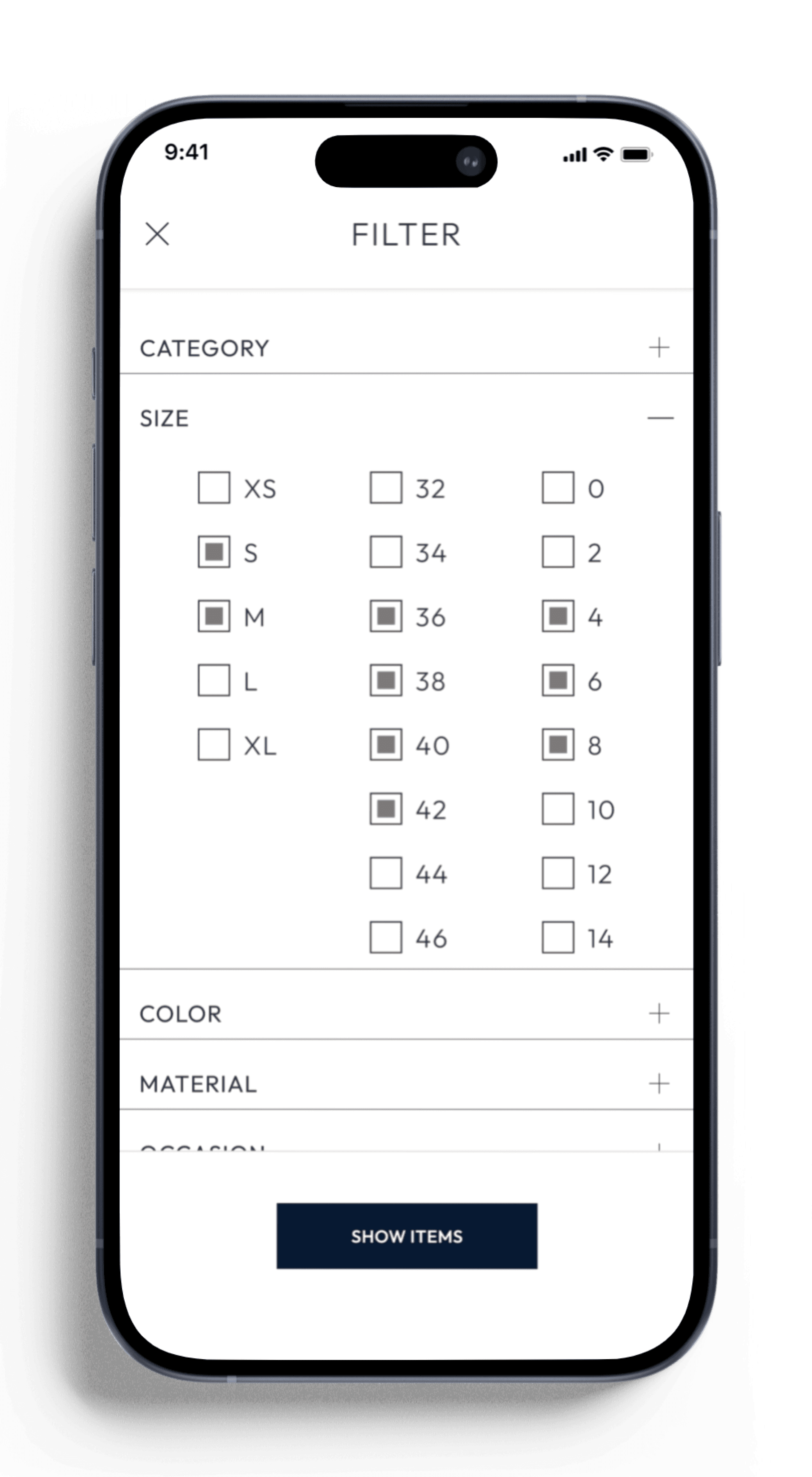
Filter size Screen
Filter size Screen
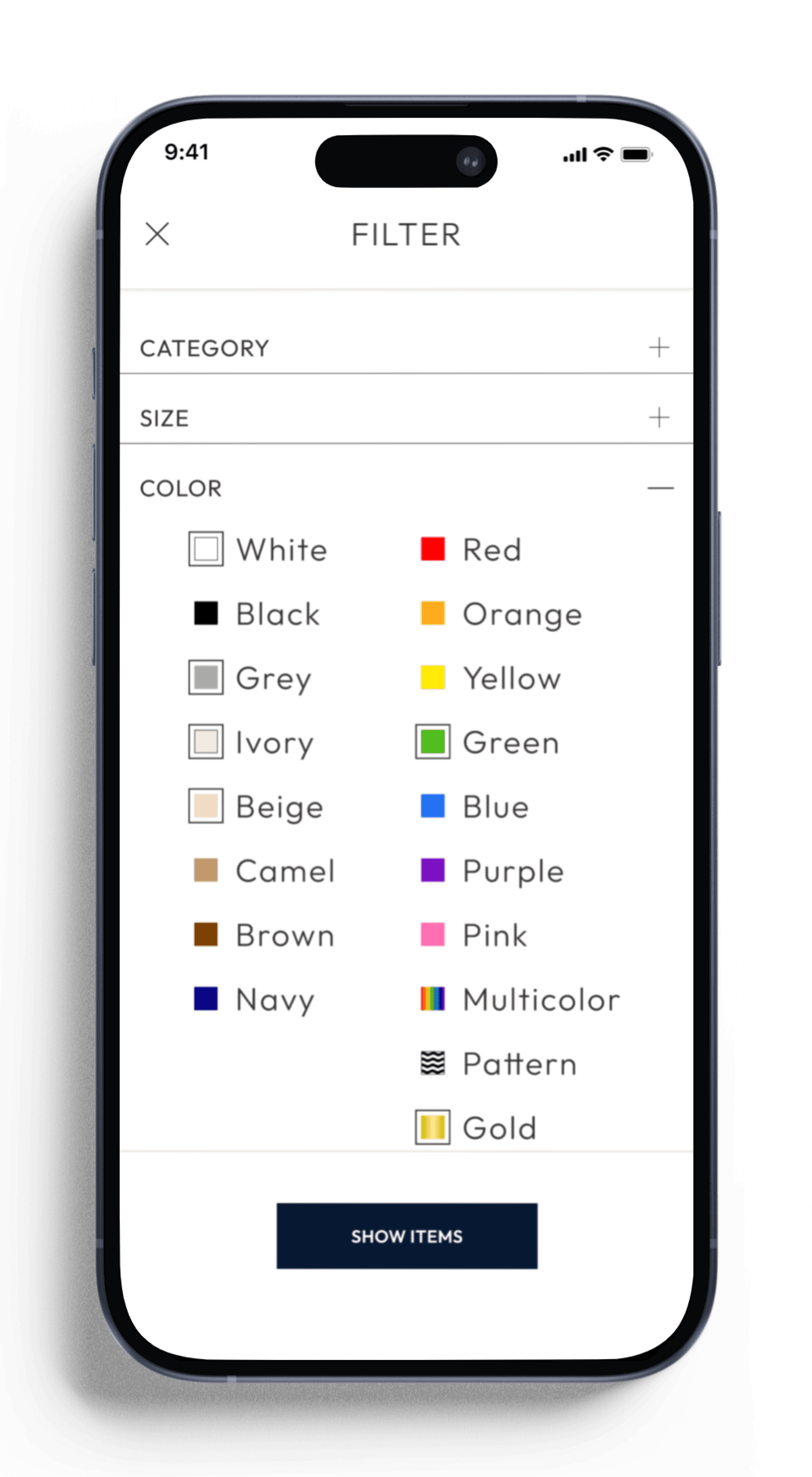
Filter Color screen
Filter Color screen
chosen filters Screen
chosen filters Screen
New arrivals filtered
New arrivals filtered
wish list selected
wish list selected
Wish list updated
Wish list updated
shopping bag
shopping bag
checkout screen
checkout screen
checkout in progress
checkout in progress
checkout confirmed
checkout confirmed
retrospective
overview
The Beau Monde app aimed to create a seamless, captivating platform where users could easily discover unique fashion pieces and effortlessly curate their own personalized collections. The primary objective was to merge high-end aesthetics with a user-friendly and practical interface, ensuring that users could intuitively navigate the app, while still feeling immersed in a luxurious shopping experience.
what went well
visual design:
The attention to detail in typography, color palettes, and imagery successfully established a minimal and modern aesthetic, creating a high-end, luxury feel that aligns with the brand's vision of a refined experience.
user feedback:
User testing validated many design decisions, particularly the clear layout and navigation. Users appreciated the straightforward features such as auto-suggestions in search fields, extensive filters, and an easy checkout process.
accessibility:
Accessibility was prioritized from the start to ensure high contrast for readability & keyboard navigability.
prototyping:
Figma’s tools facilitated smooth prototyping and quick iterations based on feedback.
challenges
streamlining:
One challenge was simplifying the user journey by reducing unnecessary steps during key actions, like navigating between wishlist and shopping cart. Initial versions required too many steps to complete tasks, disrupting the flow. After user testing, I streamlined processes to improve efficiency and reduce friction.
key insights & improvements
balance:
While the app needed to be visually striking, it was essential to reduce cognitive load by minimizing the steps users had to take to complete actions. Streamlining user flows will be a key focus in future projects.
actionable takeaways
Continue refining task flows to minimize user effort and improve overall efficiency.
Implement more frequent, iterative user tests to catch potential usability challenges early.
BEAU MONDE
BEAU MONDE
Font families:
Aa
Outfit
Regular
Medium
Regular
Suranna
Aa